{:.full}
Background
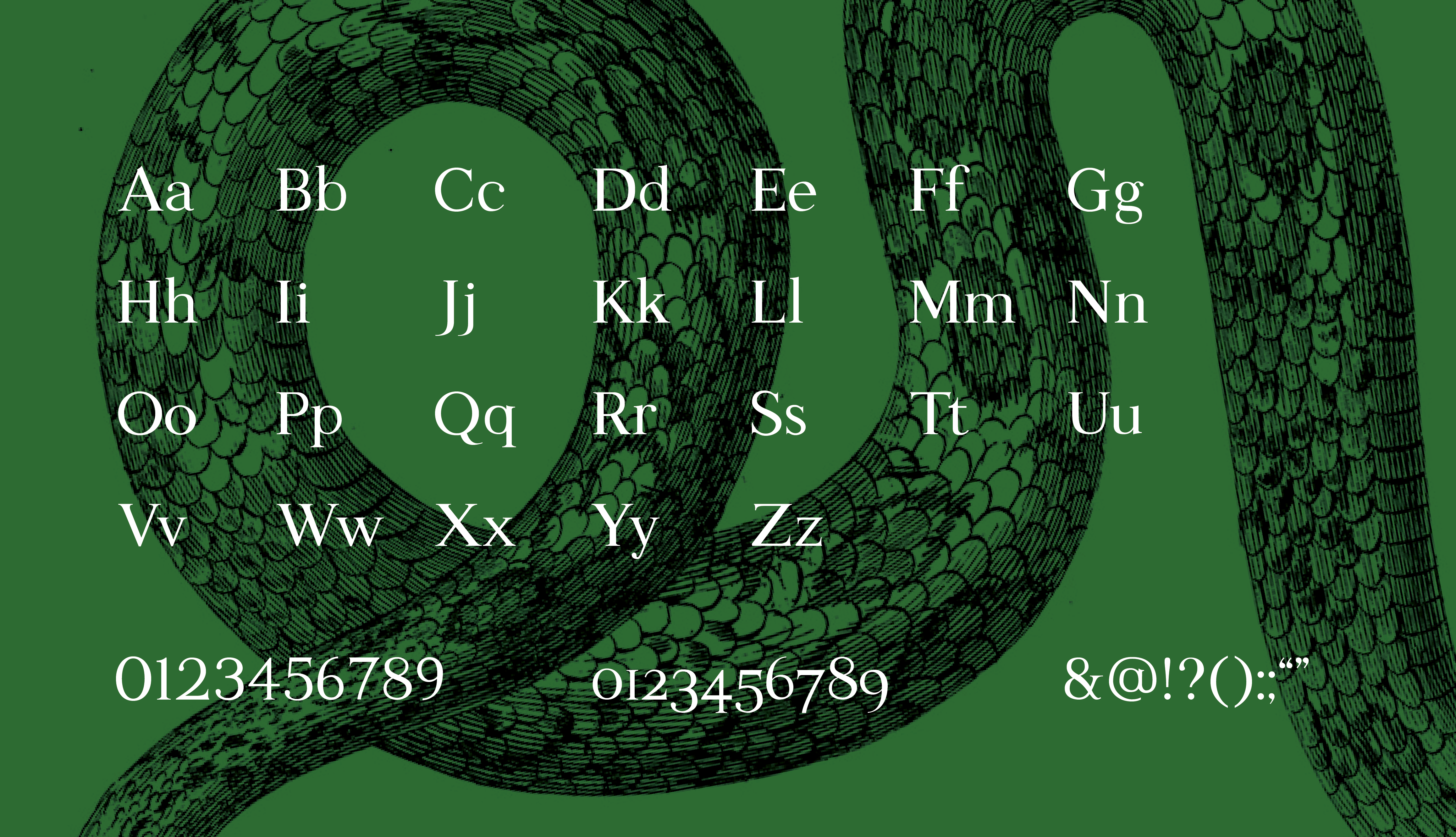
I designed a typeface for my Typography 3 class at Northeastern University. We were tasked with designing a typeface that could be used for body copy at 7pt. We were allowed a lot of freedom in what we wanted our typeface to be.
After some sketching to figure out where my interests lied, I decided to design a more modern transitional serif that could work on screens.
{:.half}
{:.half .right}
{:.full}
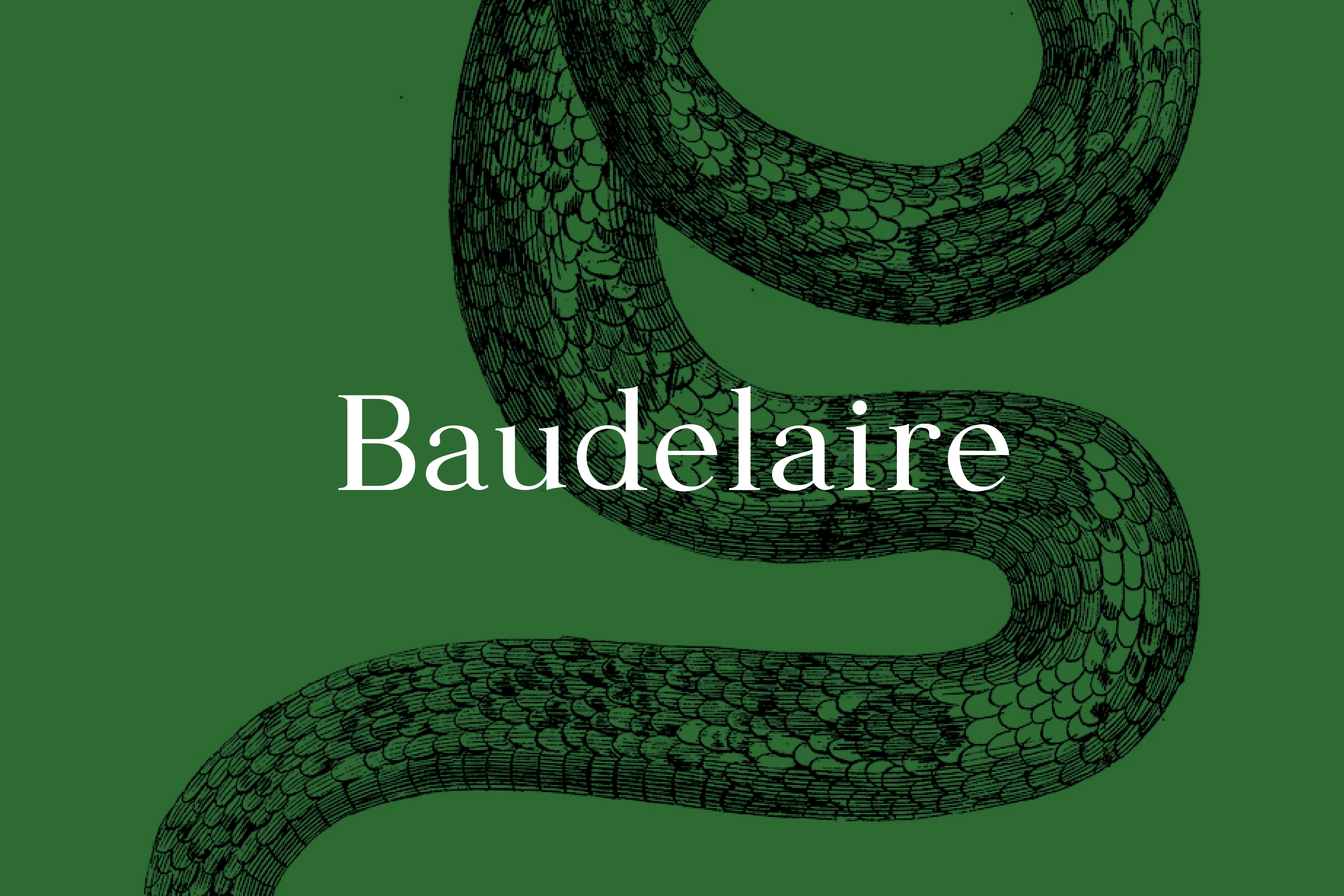
Naming
As the typeface came together, from capitals, to lowercase, to punctuation, to metrics, its personality formed. It started reminding me of something you'd see in a childhood scary story. I named it after my favorite character from my favorite childhood books: Violet Baudelaire from A Series of Unfortunate Events.