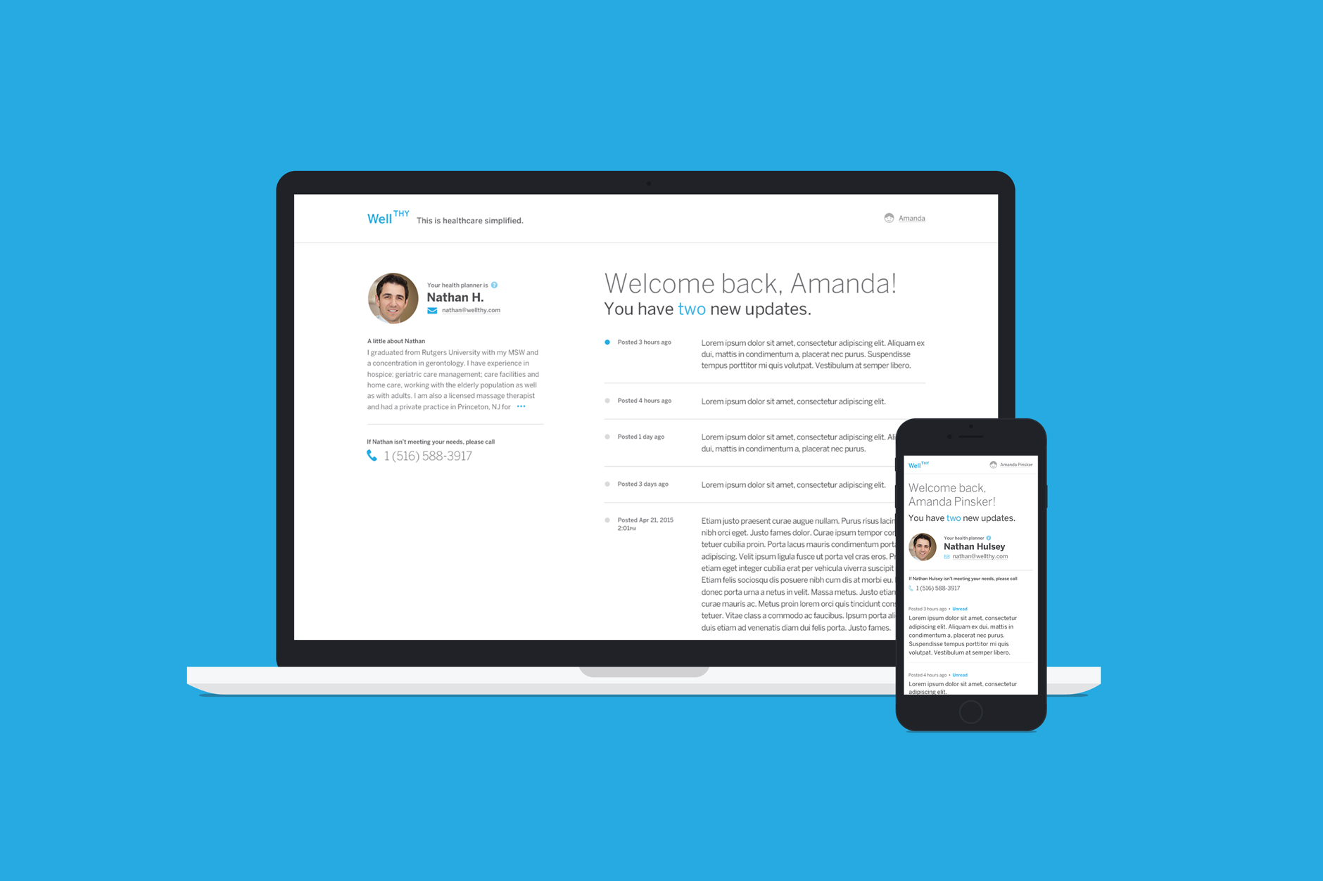
Customer dashboard, desktop and mobile
Wellthy is a service aiming to provide assistance to adult children overwhelmed with caring for a sickly parent. Wellthy provides their clients with a health planner who can assist with tasks such as finding reputable doctors, making appointments, coordinating between hospitals, or arranging transportation.
Ronik assisted with providing a web application for the health planner to easily manage and communicate updates to their customers. This would easily keep all of their information in one place, prevent confusion, and make communication more streamlined. I was part of the UX and design team and helped hash out functionality and UI design decisions.
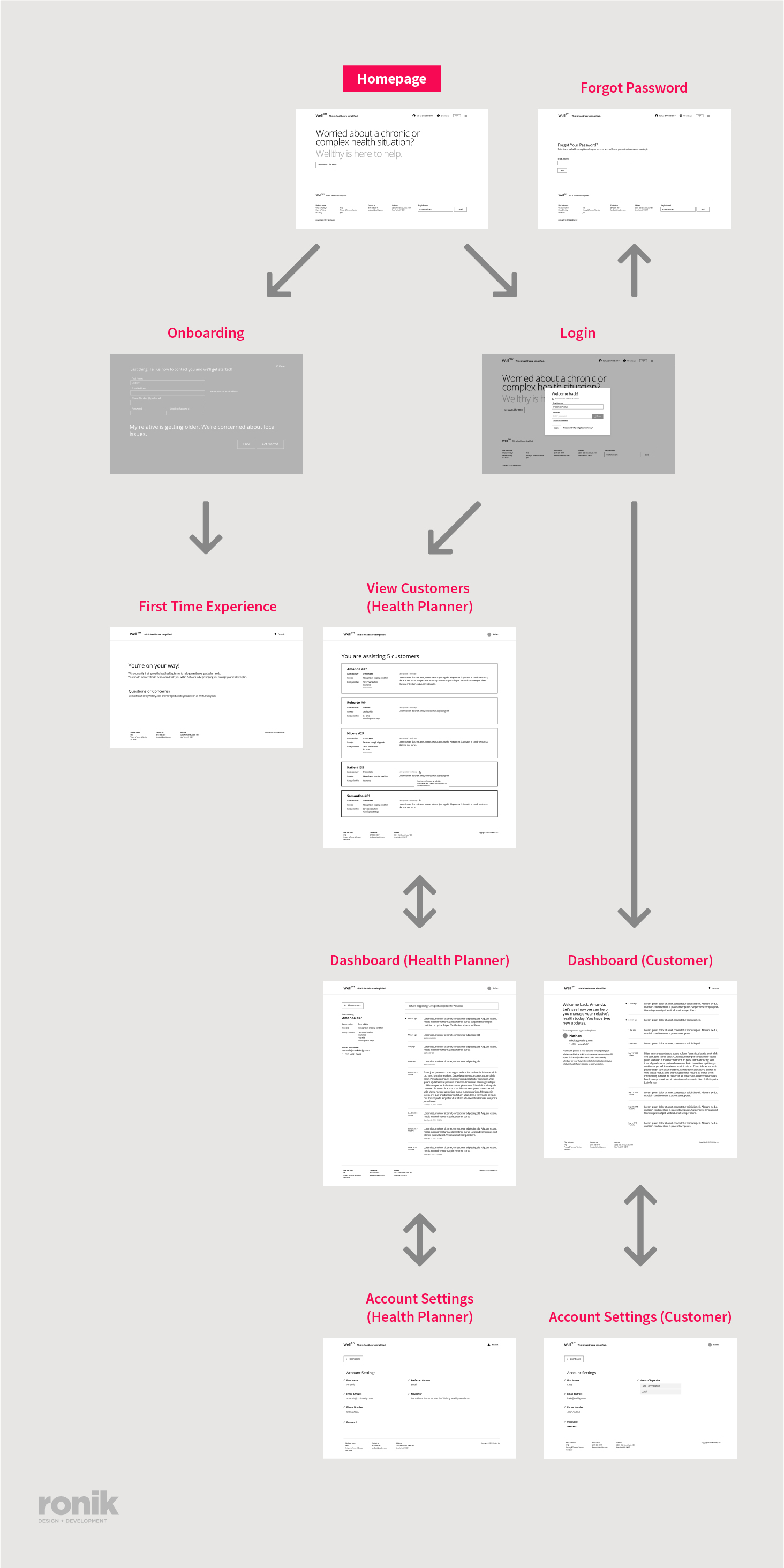
Page flows
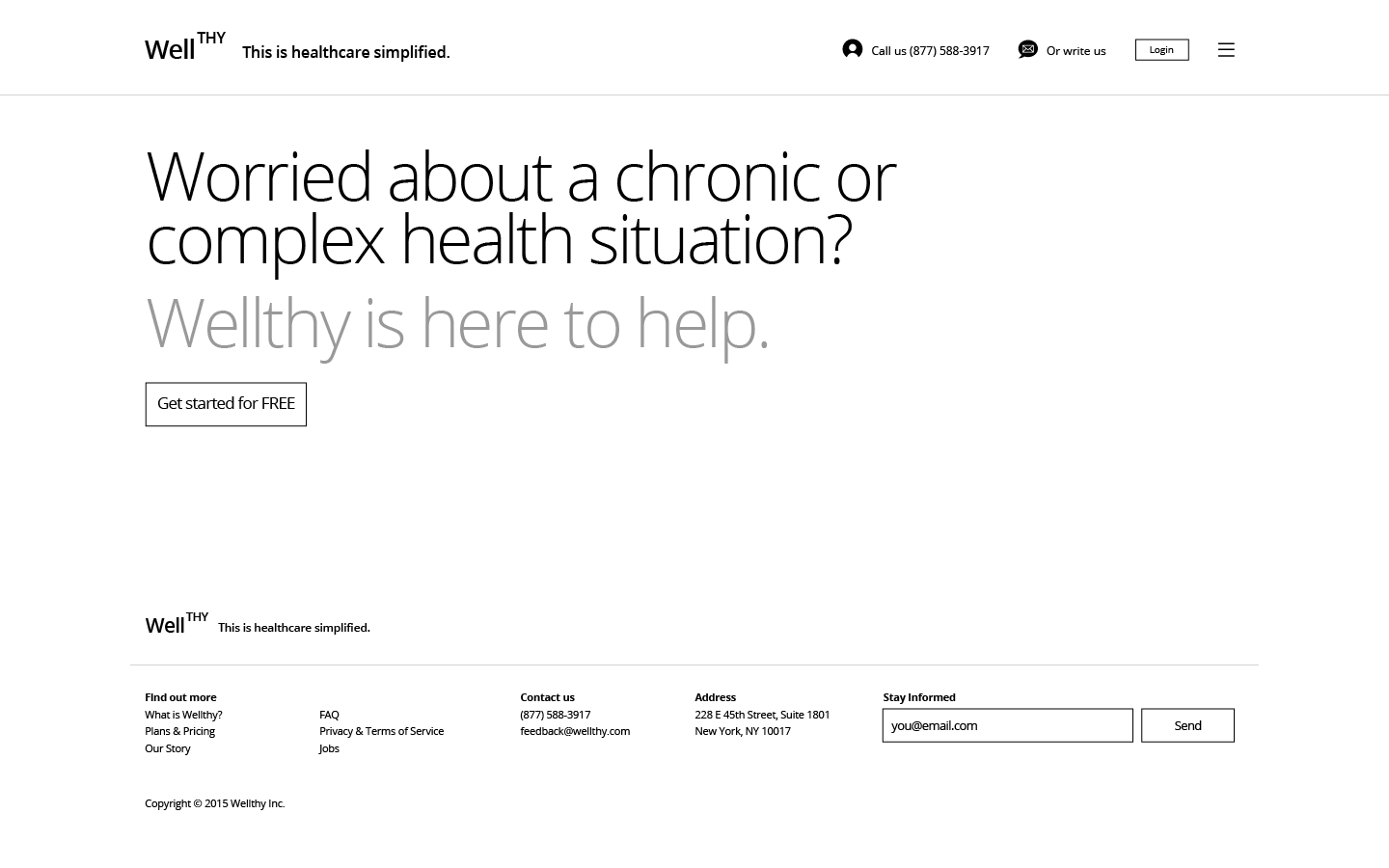
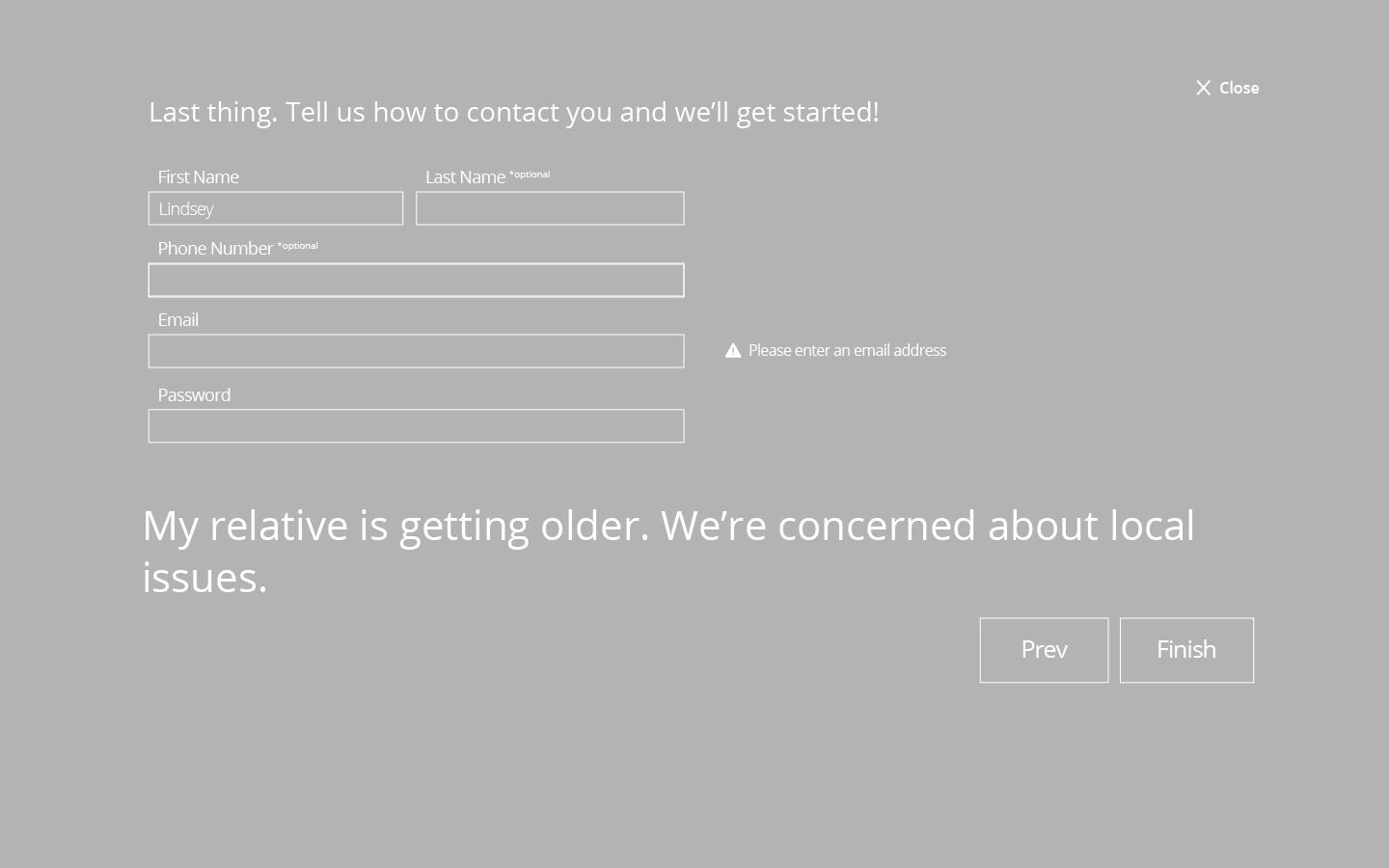
Wireframes: home page, onboarding
Flows and Wireframing
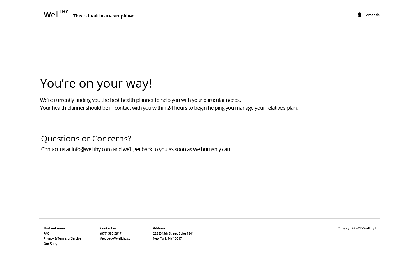
The flow is relatively simple. The health planner and the customer have different views of the same information, along with an account settings page. The health planner also needed a screen to view all of their customers. We were also tweaking a few links on their home page, such as the addition of a login button, and polishing their onboarding screens. We had to account for the period of time when a customer is signed up but not assigned to a health planner yet.
Wireframes: customer views
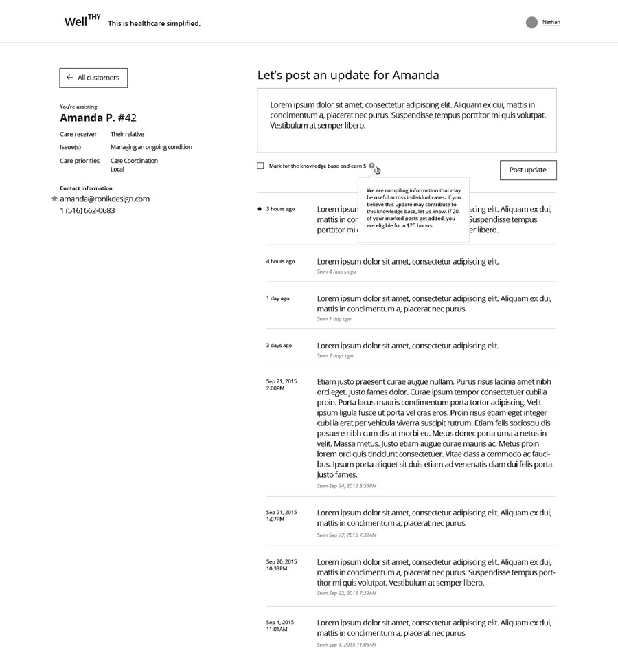
Wireframes: health planner views
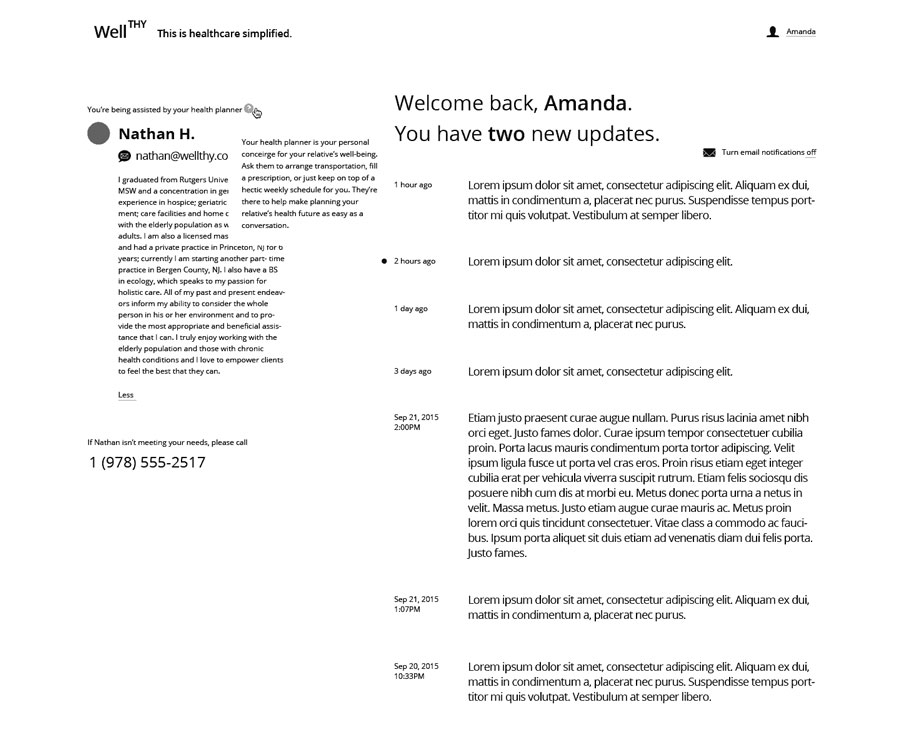
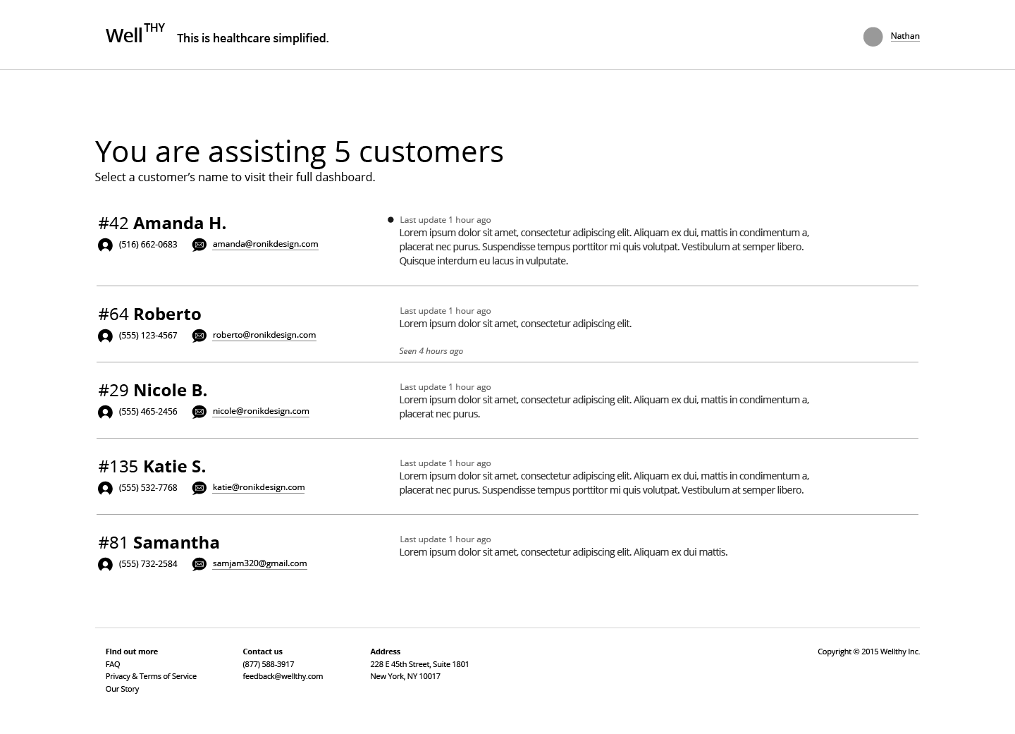
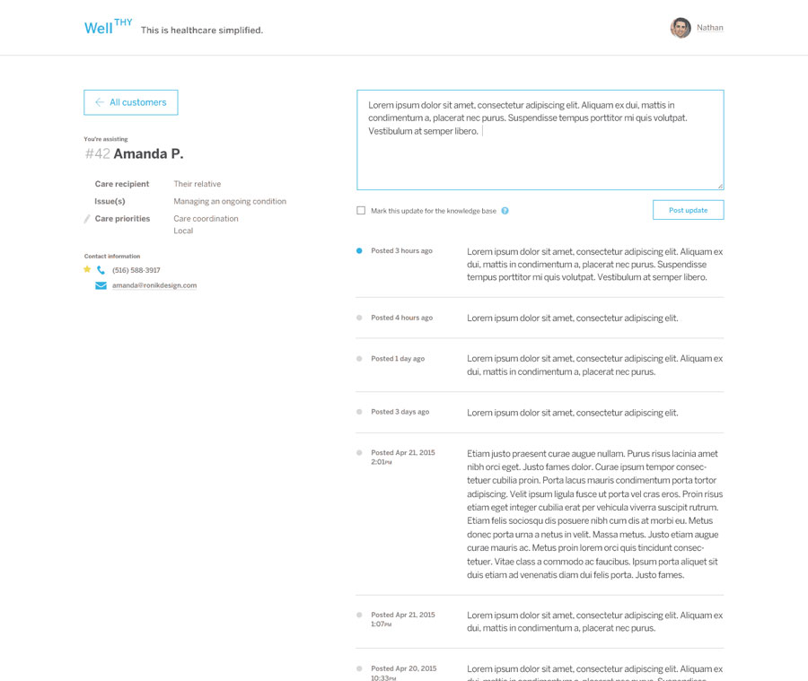
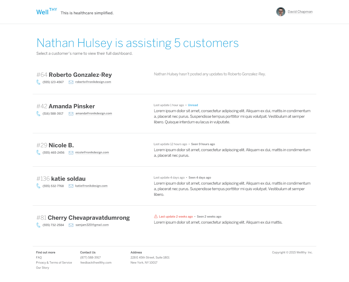
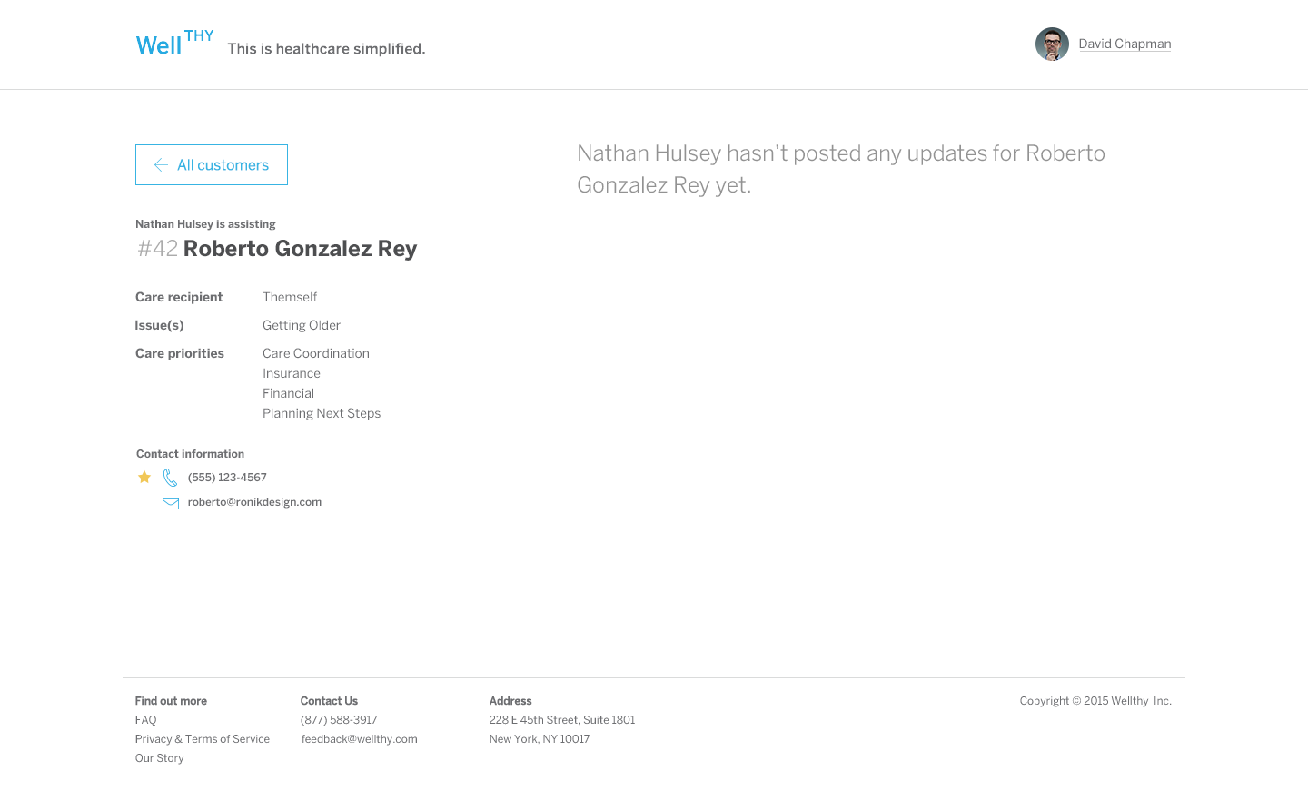
The customer sees a dashboard with information about their health planner, contact information, and updates. Updates are marked as unread or read, with a timestamp. The customer can also view a description of what their health planner can do for them. The health planner dashboard allows them to post updates, view information about the patient that the customer entered during onboarding, and the customer contact information. The health planner can see if the customer has read their update. They can also edit the patient's current "care priorities."
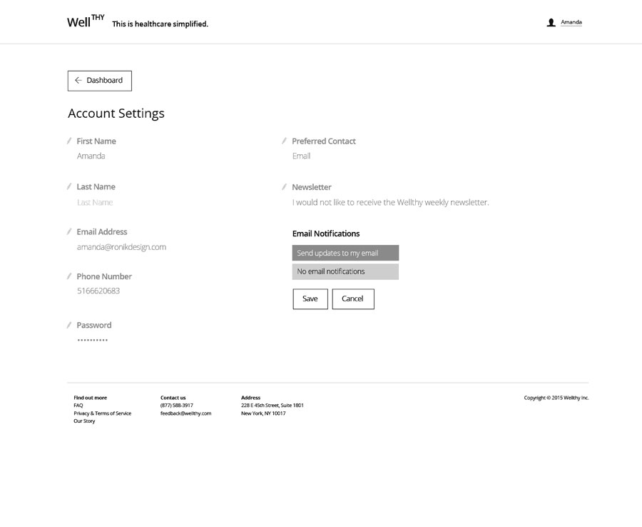
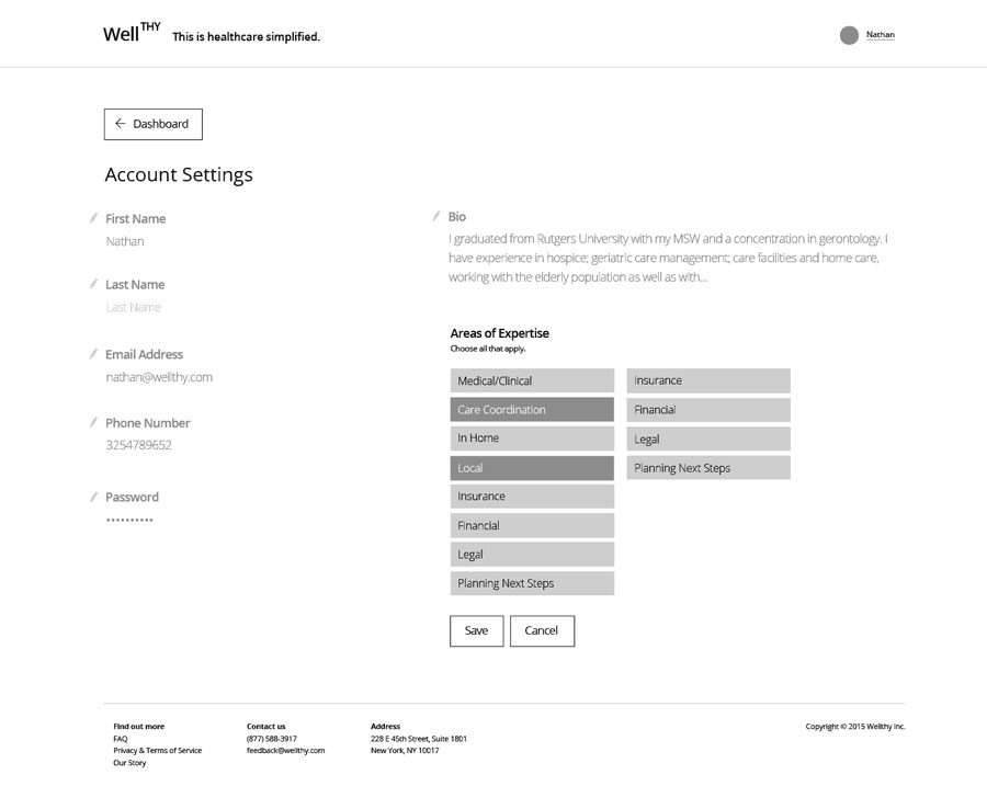
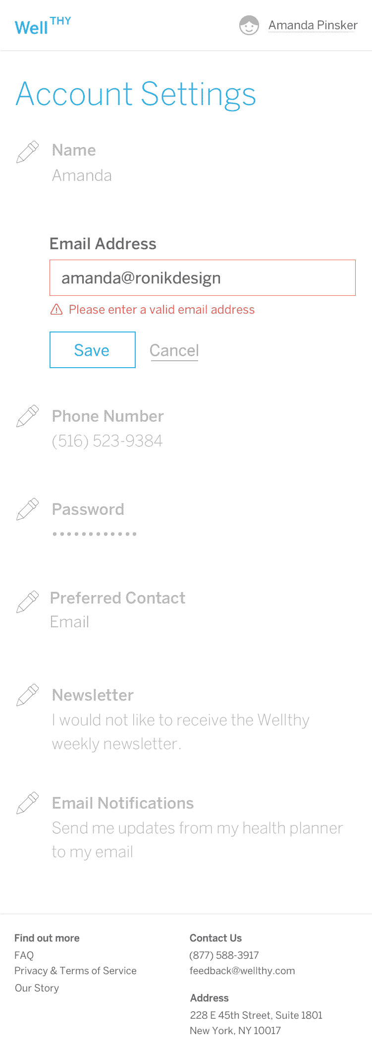
Account settings for both function in the same manner. The user can click on a pencil icon to update a single item, instead of sending the whole form each time something needs to be updated.
Designs: health planner dashboard
Designs: customer account settings
Adding Visual Design
Moving into the design phase was simple, considering the simple and clean style the client desired. We applied their brand blue for interactive elements, also using yellow and red for preferences and error states. We didn't wireframe for mobile and instead figured out the challenges for mobile through the design phase.
Designs: community manager screens
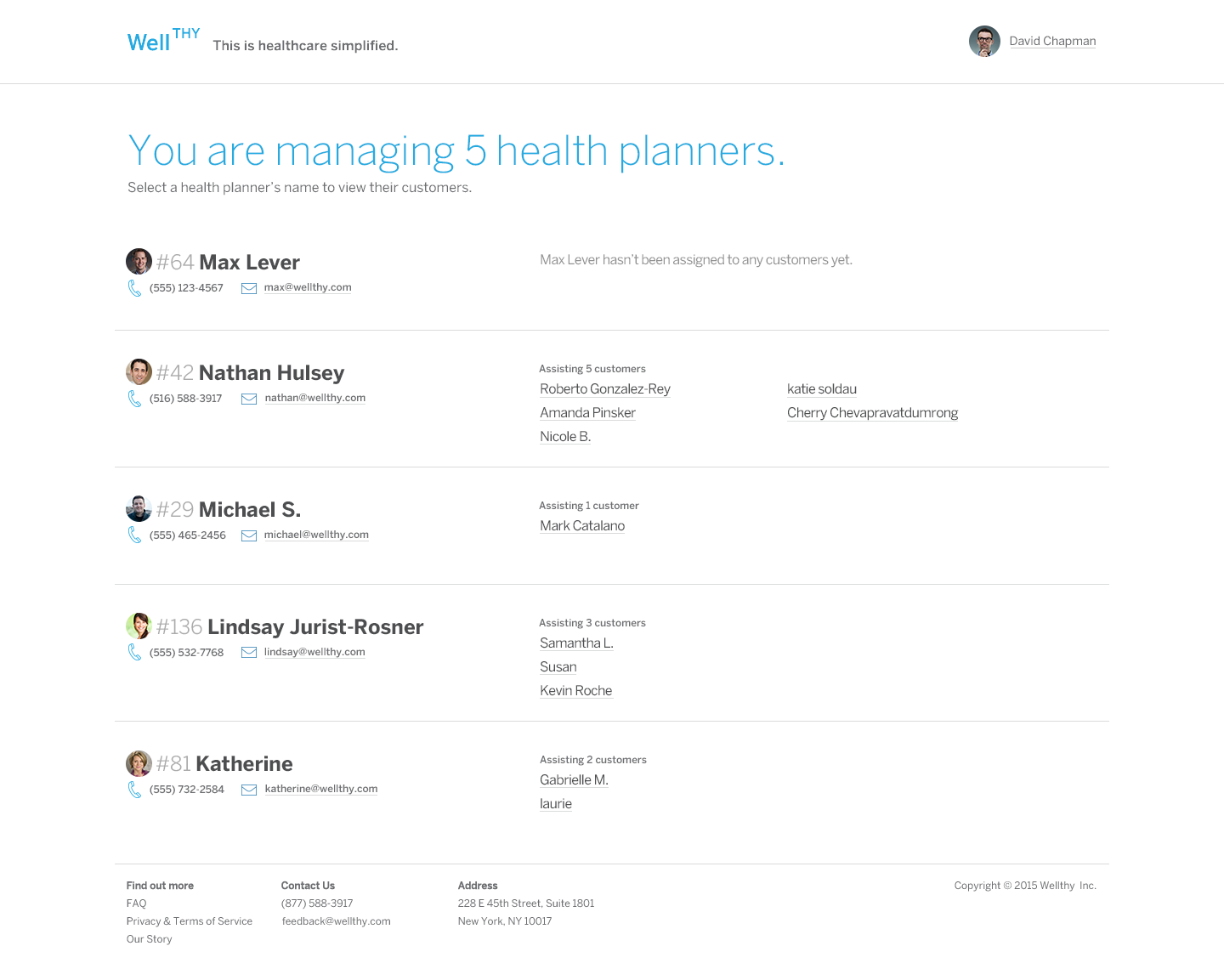
Adding administration tools
Lastly, we added a flow for a "community manager" to be able to view all health planners and their customers.
In the end, we created a clearly designed system that would make their employees' and customers' lives easier, and would be easy for Wellthy to expand as their company grew.